Source: LinkedIn post
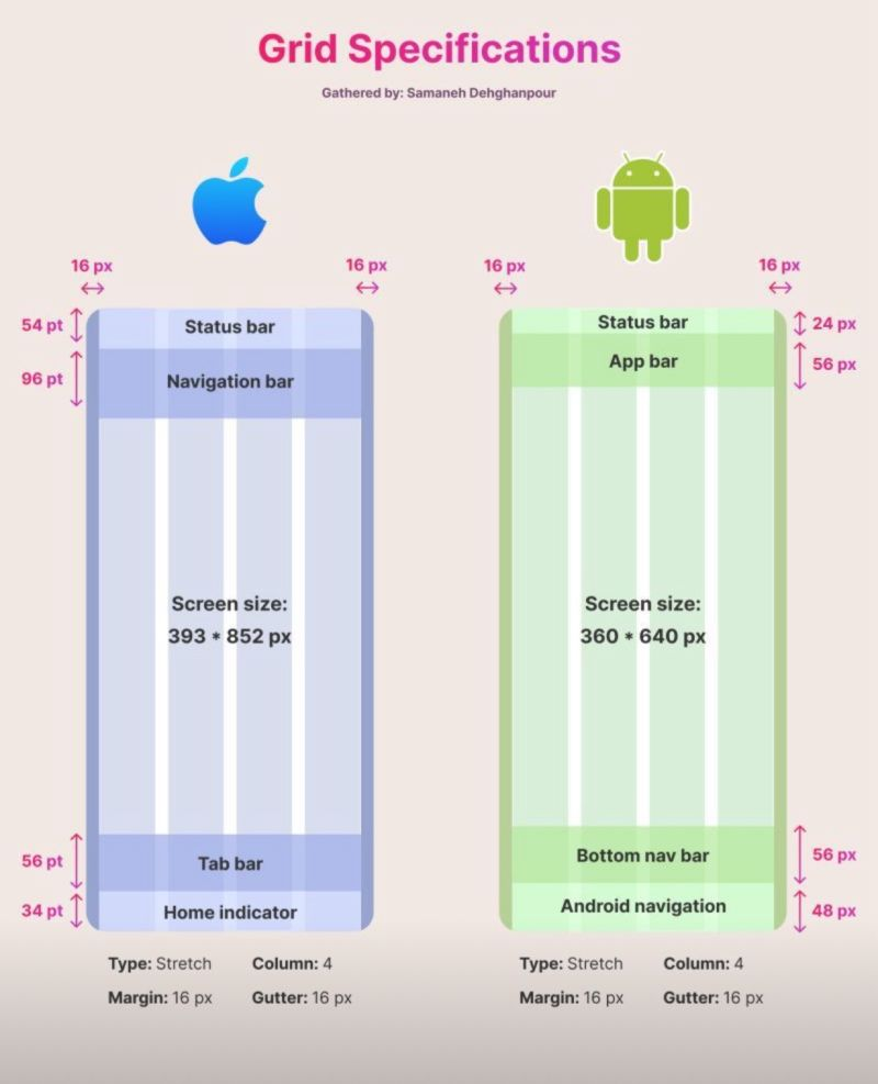
As designers and developers working with cross-platform technologies like Flutter, understanding the nuances of grid systems across different operating systems is crucial for creating consistent and high-quality user experiences. Let’s dive into some key points about iOS and Android grid specifications:
📏 **Units of Measurement**
• iOS uses points (pt):
– 1 pt = 1 dp
– 16 pt = 12 dp
• Android uses density-independent pixels (dp):
– 1 px = 1 dp
📝 **Key Points to Note**
• Screen Size Recommendations:
– iOS: 375 pt (width)
– Android: 360 dp
• Navigation Bar Heights (iOS):
– Simple navbar with small title: 44 pt
– Navbar with search bar: 96 pt
– Navbar with large title: 96 pt
– Navbar with large title and search bar: 148 pt
• Primary Call-to-Action Buttons:
– iOS: Upper right corner
– Android: Bottom right corner (Floating Action Button)
• Search Icon Placement:
– iOS: Tab bar
– Android: Upper right corner
🧪 These insights are not just crucial for design, but also play a significant role in ensuring your **WidgetTests** are accurate and reflective of real-world scenarios.
Understanding these differences is essential for delivering a seamless user experience across platforms. By accounting for these subtle yet significant variations in our design and development processes, we can create more effective and intuitive applications for both iOS and Android users.