Button design
This SwiftUI code defines a simple user interface in an iOS/macOS app.
import SwiftUI
// Basic view
struct ContentView: View {
    var body: some View {
        Text("Tap me")
            .font(.largeTitle)
            .padding()
            .background(Color.green)
            .foregroundStyle(.white)
            .clipShape(RoundedRectangle(cornerRadius: 20))
    }
}

#Preview {
    ContentView()
}Code Explanation, Let’s break it down:
import SwiftUI:
- Imports the SwiftUI framework, which is Apple’s declarative UI framework for building user interfaces.
struct ContentView: View:
- Defines a structure called
ContentViewthat conforms to theViewprotocol, making it a SwiftUI view. - SwiftUI views are lightweight structs that describe the UI and its behavior.
var body: some View:
- A required computed property in the
Viewprotocol. - Returns the content of the view, which SwiftUI renders on the screen.
- The
some Viewtype indicates it returns an opaque type conforming toView, allowing flexibility in the view hierarchy.
Text("Tap me"):
- Creates a
Textview displaying the string “Tap me”. - This is the main UI element in the view.
- Modifiers:
SwiftUI uses a chain of modifiers to customize the appearance and behavior of views. These are applied to theTextview:
.font(.largeTitle):- Sets the text font to a large, bold system font style (typically used for titles).
.padding():- Adds default padding around the text, creating space between the text and its background.
.background(Color.green):- Sets a green background behind the text.
.foregroundStyle(.white):- Changes the text color to white, ensuring it contrasts with the green background.
.clipShape(RoundedRectangle(cornerRadius: 20)):- Clips the view (including the background) into a rounded rectangle shape with a corner radius of 20 points, giving it smooth, rounded corners.
#Preview { ContentView() }:
- A SwiftUI preview macro used in Xcode to display a live preview of the
ContentViewin the canvas during development. - It creates an instance of
ContentViewfor rendering in Xcode’s preview pane.
What the Code Does
- The code creates a simple UI element: a white “Tap me” text in a large font, displayed on a green background with rounded corners and padding.
- The result looks like a tappable button (though no tap interaction is defined here).
- The
#Previewallows developers to see this UI in Xcode without running the app.
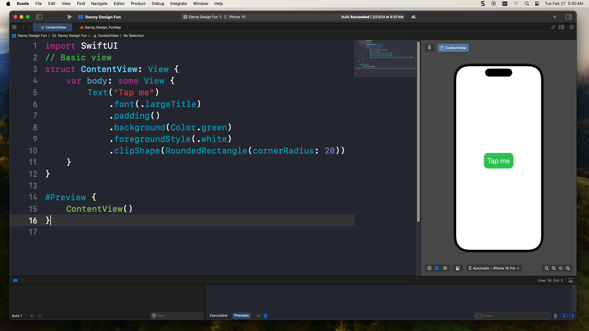
Visual Output
- A rounded rectangular button-like view with:
- White “Tap me” text in a large title font.
- Green background.
- Rounded corners (20-point radius).
- Padding for spacing.
Key SwiftUI Concepts
- Declarative Syntax: You describe what the UI should look like, and SwiftUI handles rendering.
- View Modifiers: Chained methods (like
.font,.background) customize views. - Previews: The
#Previewmacro enables rapid UI iteration in Xcode.
This snippet is a basic example of SwiftUI’s power to create styled UI components with minimal code.